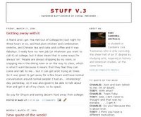
But no longer! As a way to avoid doing my C programming assignment, this morning I completely changed the template for my blog. Thought it was time for a change and all that. I've adapted a template from a great site,noipo.org, which offers blogger templates under a Creative Commons license. The template was really well commented and set out etc., which made it very easy to adapt.
So... what do you think? Does it look ok on your computer? It seems to resize well on my screen, but let me know how it does on yours. There's still a few little things I have to fix up, but it's pretty much done.
I have no idea how it does in Internet Explorer, but then if you're using IE you're pretty much dead to me anyway, and I don't really care what it looks like for you. Use a real browser people.


4 comments:
looks fine with IE :P~
Hey Maddy,
I am a long time ready; first time commentor - I really like the design. I love Maroon - can't get enough of the stuff.
As a widescreen viewer - I find the layout hasn't utilised all the space possible - but apart from that it looks nice - easy to read - and not at all boring!
M
yeah - again is good design but confusing/annoying/needs some getting used to for widescreen
Hmmm, don't know what to do about the widescreen thing. I'll have a look at the template and see what I can do, but I have a sneaking suspicion it could be rather complicated to change!
Post a Comment